 By Lewis Horn, lhorn@lessitermedia.com
Graphic Designer, Lessiter Media
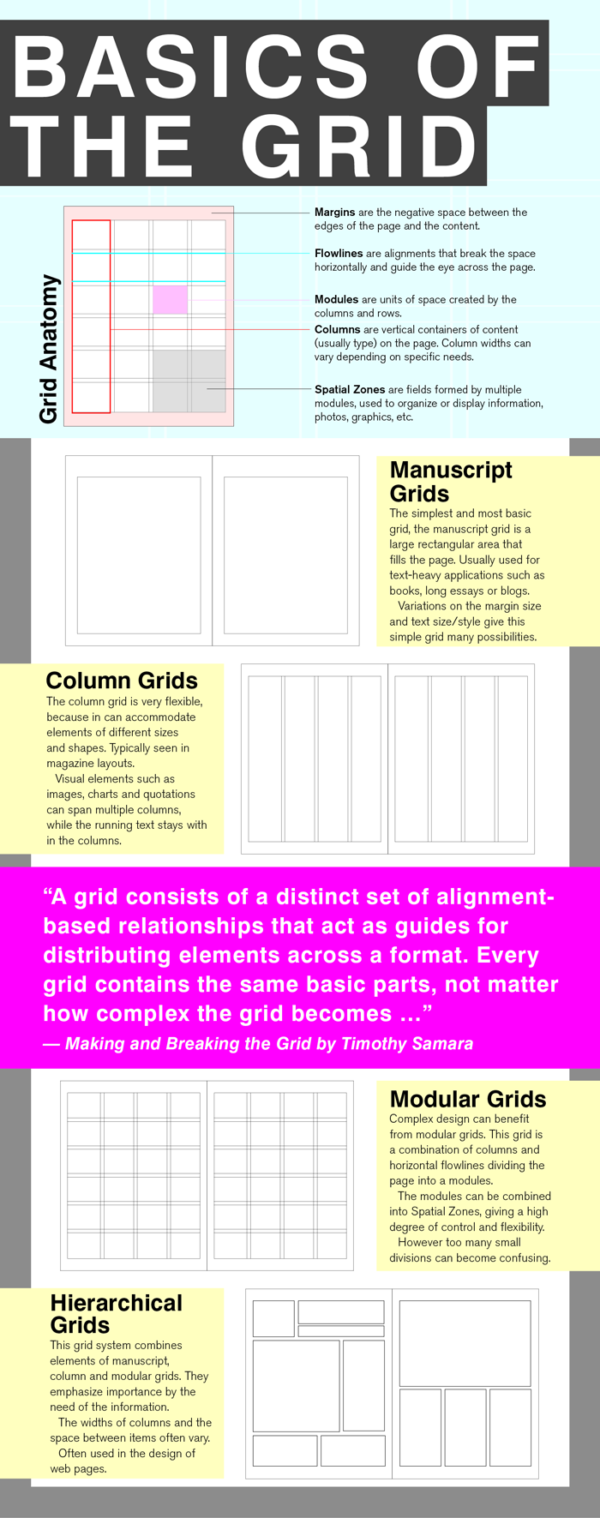
Clear and organized communication is key in getting your message across. A great first step in the design and flow of your communication is to employ a grid system into your design. Fields of text, photos, graphics, data and callouts all need to be organized in a way that tells your story effectively.
A grid system is one approach to organize and control the way your reader interprets your message. Depending on how you create a grid, it can be loose and flowing, rigid and mechanical, or somewhere in between.
Some benefits of using a grid system are efficiency, continuity, and clarity.
- Efficiency – Many of the design decisions have been made when creating a grid, or using a premade grid system. So, your designer can focus on the layout more than the structure.
- Continuity – With a grid system created, multiple people can work on a project and they will all have the same structure. Or, related projects can maintain a visual consistency.
- Clarity – Using a grid system can help organize your information into easily-digestible units within the structure of the design.
Grids are a great tool to have. Every design/communication problem is different and there are many different grid systems to use as starting points to address a given problem. I've put together a few tips and ideas that will serve as a good first step when considering using a grid style layout.
If you have any questions about using a grid or would like to see some examples of how we've used a grid system for our own materials, drop me a line. I'd be happy to discuss further with you.


